


Titles
Indicator Alignment
Unit
Coordinates


Create word clouds shaped like a baby.

Design word clouds featuring a mother and baby.

Generate word clouds in the shape of a baby bottle.

Create word clouds shaped like a baby nappy.

Create word clouds shaped like basketball players.

Design word clouds shaped like basketballs.

Generate word clouds shaped like tennis balls.

Create word clouds shaped like volleyballs.
Titles
Indicator Alignment
Unit
Coordinates

If you're looking to visually analyze your data using a graph, our Scatter Plot Creator provides an excellent way to represent data as points, offering a precise depiction of the relationship between two variables along the horizontal x-axis and the vertical y-axis. This tool enables you to analyze data patterns and trends accurately using the provided values, empowering you to make informed decisions based on your data.

With our scatter plot maker, you have the flexibility to tailor your plot's appearance. Customize the main title, x-axis title, and y-axis title to suit your needs. You can also precisely position data points on the plot—whether you prefer them on the left, right, center, top, or bottom. Select any values for the two variables you wish to analyze, and you have the option to specify up to six coordinates, each with a distinct name. Enter the values along the x and y axes, and easily add or clear data to create your graphs with precision.

Once you have keenly reviewed the scatter plot to ensure its accuracy and alignment with your data visualization objectives, it's time to save your work. Simply click the 'Download' button to save the scatter plot, which will be downloaded in the universally recognized PNG image format. This versatile format allows you to easily share your visual insights with anyone, without any hesitation, making it a convenient way to share your data-driven findings.

Reference lines in a scatter plot can take on both positive and negative values, providing a meaningful understanding between two variables. Positive values display an upward direction, indicating that if one variable increases the other will also increase as well. However, negative values show a downward direction, where an increase in one variable will decrease in the other. These reference lines offer valuable insights, enhancing a clear understanding between variables in a precise manner.

Our Scatterplot Creator offers a real-time feature of updating the data in no time. This will streamline the process by taking the decisions instantly and accurately, correcting the errors on the spot. Visit our website to accurately analyze and visualize the data points immediately.

Our Scatter Plot Chart Maker is a versatile free online tool for instant and precise data analysis and visualization. The tool is a reliable solution where any user data is not stored on our server. The tool is seamlessly accessible on any device without any compatible issues with an internet connection. What are you looking for? Visit our website and plot a graph.

Other useful information
Explore our visual guides and infographics
Online scatter plot creator
Benefits of scatter plot creator
How to use scatter plot creator
Frequently Asked Questions
To create a scatter plot or graph, you need to select the position and coordinates, input your x-axis and y-axis values, and then click on ‘Add’ and ‘Clear’ as needed to adjust the data. The scatter plot will be generated automatically as you make the changes.
To see the values, just hover your mouse over the line, and the values will be displayed on the screen.
You can enter up to six entries in the scatter plot maker. You can enter the data as per your choice. Simply select the coordinates, enter the values and you are ready to proceed.
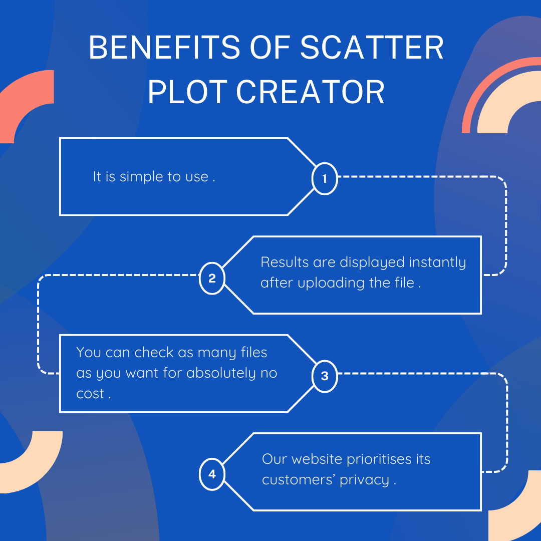
Our website is free and you can use it as many times as you want. There are no free trial uses, after which you will have to pay for using our services. We won't charge you anything.
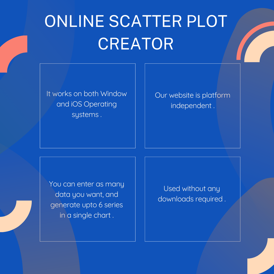
Our website is completely web-based and therefore provides cross-platform support. This means that our tool supports all versions of Windows. It not only works on Windows operating system, but can work on any other operating system, that supports a browser.
Yes, our website works on browser, and therefore supports both iOS and Android platforms
Our website does not send any files to the server. Your data is safe when using our platform.
Once you enter the desired data, a scatter plot will instantly generate the result which will be ready to download in image format.
Our website does not require you to sign up or create an account. The platform is absolutely free and you can generate as many plots as you want.
Create scatter plot is 100% safe to use and does not save your files. No data is uploaded and hence all your files are safe with you. In case you refresh the browser, you will have to reupload the folders, for the process to take place since, files are not saved on our website.
All processing is done on your browser, and no files are transferred to the server. Hence your files are 100% safe.
Since our website does not use any servers and does not store your data, the file that you have uploaded will not be saved. You need to reupload the file again.
The output will be downloaded in PNG format, i.e., image format, which you can use in your designs, and documents or just share with friends.
Since our website does not use any servers and does not store your data, the file that you have uploaded, will not be saved. You need to reenter the data.
Yes, you can download the output after generating your scatter plot. Just click on the download option on the top right corner of your screen, and the result will be downloaded.
A scatter plot is an online tool used for the graphical representation of data in which each point is displayed as a dot. It is used to understand the relationship between two variables along the horizontal and vertical axis.
You can use a scatter plot when you want to understand the relationship between two variables one plotted along the horizontal axis and the other along the vertical axis and to analyze the trends and patterns between them.
There are two axes in a scatter plot, the horizontal x-axis, and the vertical y-axis, representing the variables that need to be compared.
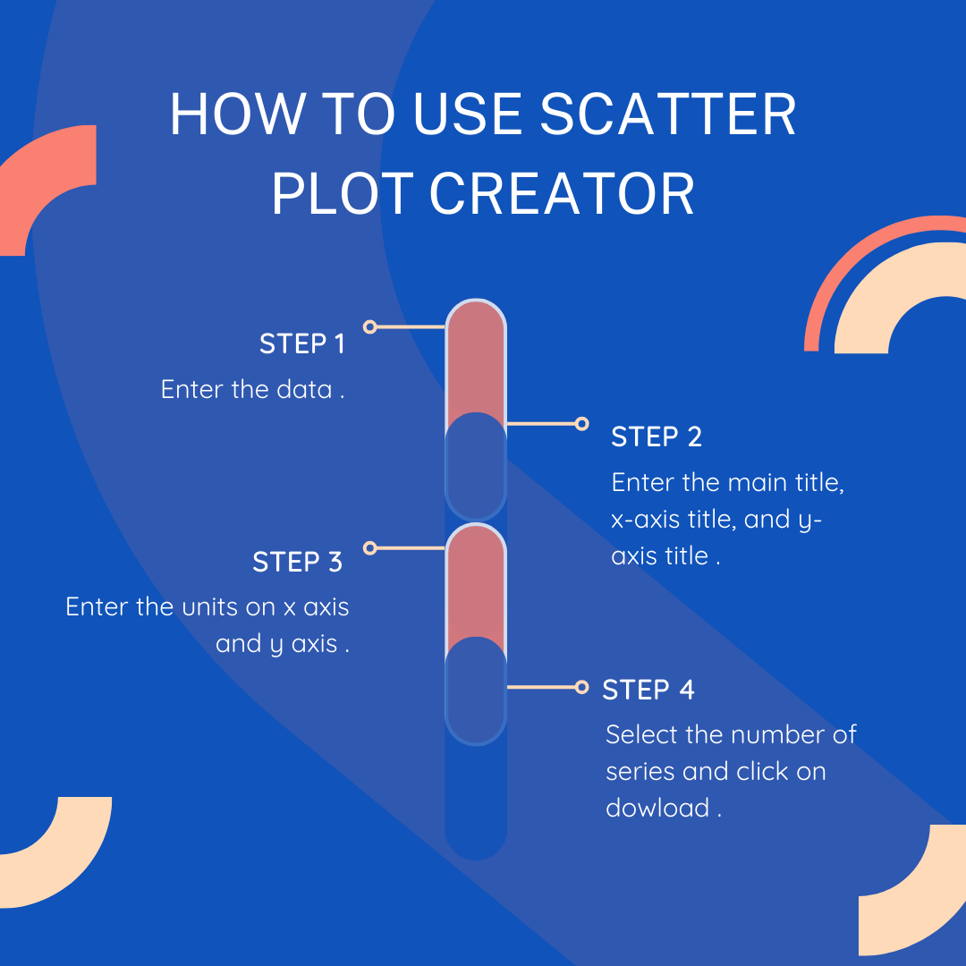
You can create a scatter plot by adding a main title, x-axis title, and y-axis title to your graph. Select the alignment positions (1, 2, or 3) and specify the units for both the x-axis and y-axis as needed. Select the number of coordinates and input the values for each series on the x and y axes along with the series title. Finally, review your scatter plot and download the file for further use.
You should label the data points to identify each data value on the scatter plot to analyze the data accurately.
No. There is no need to specify any shapes and colors of the data points on our scatter graph creator as it automatically determines without any specifications. Simply enter the coordinate values of the x and y axes and label the series.
A trendline is a line or plot that represents the relationship between values on the x-axis and y-axis, enabling us to understand the data better.
The interface of the tool shows title headings where you can add the main title, x-axis title, and y-axis title to understand the purpose of the graph.
A maximum of six data series can be created with this scatter plot creator and easily compare different sets of data.
The different annotations in a scatter plot creator are used to enhance the visualization of the data such as titles, labels, data points values, series name, and reference lines for better clarity.
The regression line is the correlation between two variables and the trendline is used to identify data trends over time.
Anyone looking to analyze the relationship between two values can utilize it. For instance, a marketing team can use it to understand the relationship between expenditure and product sales. Educators can utilize it to monitor the performance of students in various subjects over a year. Researchers can explore the relationship between patient outcomes and medication dosage.
Scatter plot graphs are invaluable tools in education for tracking progress over time and refining educational strategies to enhance student performance. For example, educators can use them to examine the correlation between subject scores over the year or between scores and attendance rates. By analyzing these relationships, educators can identify areas for improvement and support students in achieving their academic goals.
Healthcare professionals can utilize scatter plots to gain strategic insights into data and pinpoint specific health conditions for targeted evaluations. For example, they can plot patients' medical conditions on the x-axis against medication usage on the y-axis, or they can plot patient age against prevalent conditions like diabetes or hypertension, comparing different age groups with similar conditions on the y-axis to identify patterns.
Create Stunning Word Clouds with MakeWordCloud – Trusted by Over 100k Users
Join thousands of users who rely on MakeWordCloud.com for effortless and secure word cloud creation, customization, and sharing tools.